How to Know if Your Healthcare Website is Outdated
Posted on
According to Google, 5% of all search queries are healthcare related. Even that small percentage amounts to over 1 billion searches per day. Knowing what specific questions and queries these users are looking for is extremely important to the success of your website. But it won’t be enough if your website is outdated.
People frequently visit healthcare websites because they want information about health conditions and treatments or they are looking for a new provider. Your website is their first impression of your practice. If your site is outdated, visitors might view your practice as being out of touch, poorly managed, disorganized, or stuck in a bygone era.
So, what are the most obvious signs that your website is outdated? In this article, we’ll take a closer look at those signs and offer some suggestions about improvements you can make to bring your website into the 21st century.
Is Your Website Unresponsive with Slow-Loading Pages?
A website unresponsive to different devices and screen sizes makes it difficult to read and leads to an unsatisfactory user experience. A modern website must automatically adjust to desktops, laptops, tablets, and mobile phones.
An outdated website will also have slow-loading pages. Websites built using older code are naturally more sluggish. Unfortunately, today’s healthcare consumers are impatient and often pressed for time. If it takes longer than three seconds for your pages to load, nearly half of your visitors will leave your site immediately. Up-to-date websites use HTML 5 coding to store data locally on a user’s browser, eliminating the need for HTTP cookies so content loads faster. HTML 5 allows for a faster, smoother experience due to its focus on mobile device compatibility.
Does Your Site Have a Bad Overall Appearance?
Your healthcare website should have a clean, uncluttered, modern appearance. It should avoid older type fonts and colored backgrounds that make reading your content difficult. Use easy-to-read fonts and content formatted with headings and subheads to separate different sections and topics. Avoid long content that fills your pages without breaks and overwhelms readers.


To improve your overall appearance, use a content management system (CMS) such as Squarespace or WordPress. Squarespace is a good option for designers who aren’t tech-savvy and can afford a more expensive service. WordPress is less costly and more customizable with more design themes and useful widgets.
Is Your Site Mobile-Friendly?
According to DataReportal.com, 92.4 percent of the world’s internet visitors now use mobile phones to go online at least some of the time. In fact, mobile phones now account for more than half of our total online time. If your website is not mobile-friendly it will alienate users and hurt your Google ranking.
Google knows that user-preferred mobile phones are convenient for accessing health services on the go. That’s why your website needs a mobile-friendly interface. Without it, your visitors are forced to pinch-zoom in and out just to read your content, which is frustrating, time-consuming, and inconvenient, not to mention a clear sign that your site is outdated.
Does Your Website Have Missing Links and Buttons?
Have you checked your website lately to ensure that your buttons and links work as you intended? Broken links on your pages will make them look old, especially if they are unresponsive or lead to error pages. This negatively affects the visitor experience and makes it nearly impossible for your site to rank on Google’s first page.
Buttons will look different on a computer than on a small phone screen. If users must zoom in on their phones to read and click a button, they will feel that user friendliness simply isn’t a priority at your practice.
Buttons shouldn’t appear to link to something if they don’t. For example, your social media icons should link back to your social media pages. If you use underlined and/or colored text, it should link to another web page with additional or similar information. If something looks like it will take the user to another page when clicked, then it should. Failure to do so is not only a clear sign your site is outdated, but Google also considers it malicious and will remove you from their database entirely.

Does Your Site Have an SSL Certificate?
Most users today can tell if a website is secure simply by looking at its URL. A URL that includes “https” and a lock icon indicates that it contains a secure socket layer (SSL) certificate. An SSL certificate authenticates and confirms your site’s identity and encrypts the data it sends to a server. This makes getting an SSL certificate for websites critically important – it shows you want to protect your web visitors.
With so many cybersecurity risks, online businesses should have SSL certificates. If your site doesn’t have one, it’ll seem outdated and not focused on users’ security.
Do You Have SEO-Friendly Website Structure?
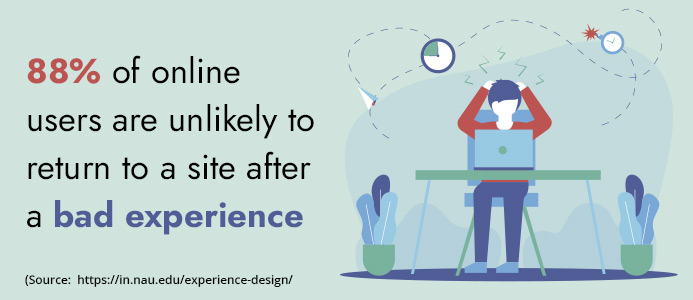
Having an SEO-friendly website structure is another critical factor if you want your site to avoid being labeled as outdated. Is your site easy to navigate? Is it logically structured to facilitate a positive user experience (UX)? This is important because Google knows that 88% of online users are unlikely to return to a site after a bad experience.
Boosting your UX need not be difficult. For example, let’s say you use a “Back to Top” button in your page content. This button allows users to jump to the beginning of a page. It’s convenient and much faster than scrolling, especially with long content pages.
Whether your navigation bar is at the top of your pages or on the side, it can enhance the UX by making it easier for visitors to find what they’re looking for. Having too many options can be overwhelming, so it pays to simplify with easily digestible navigation menus.
Does Your Website Lack Up-To-Date Content?
While overall design attracts users to your pages, good content is what keeps them there. If you don’t have accurate, up-to-date content on your site, search engines will view it as being inactive. By ignoring your content and letting it sit there unchanged for years, you’ll surely get less traffic over time.

Make sure your content is informative and relevant to visitors’ interests and includes the most recently available information about health conditions and treatments. Make sure your statistics are up to date. Remember that your website is a dynamic tool that needs regular updates to avoid being relegated to the outdated junk heap.
On an updated website, visitors won’t have to waste time trying to find the most relevant content. The most relevant and current information should be the easiest for visitors to find. Avoid sending your visitors on a scavenger hunt to find the content they need.
Is Your Site Missing Patient Testimonials?
Patient testimonials are more critical than ever. They show that your practice updates your content while highlighting your expertise through patients’ feedback. Past and current patient testimonials help you attract more new patients. Prospective patients typically look for reviews and testimonials before deciding whether they should choose a particular provider.
By regularly adding new testimonials, you’re making a concerted effort toward updating your content. If you don’t update your testimonials, new visitors will assume that your patients aren’t giving you positive reviews. They might even think your practice is no longer in business.
Does Your Site Include Online Scheduling and Bill Pay Options?
Younger patient prospects value convenience and digital options. They also prefer avoiding personal contact. Your website will appear outdated if you do not offer contactless online scheduling and payment options.
The practice they choose should offer quick, easily accessible online scheduling options. Most younger patients are more likely to choose a practice where they can quickly schedule an appointment with just a few mouse clicks at any time and from anywhere.

When it comes to bill-paying options, the notion of writing a check and mailing a payment or calling a practice to pay over the phone is severely outdated. Instead, offer online bill-pay options for time-saving convenience.
Does Your Site Offer Chat Messaging?
Today’s healthcare consumers value convenience more than ever. If a patient has a quick question, they shouldn’t have to call your practice or send you an email. Communication with a real person takes too long when you consider hold times on the phone or waiting for an email response. They might also have questions after office hours when no one can take their call.

That’s why more health practices now include online features such as instant messaging or chatbots. These features enable visitors to get their questions answered quickly. You should know that 67% of consumers used chatbots in the last year. If your website doesn’t offer instant communication, visitors will think you’re outdated.
Does Your Site Offer Online Access to Electronic Medical Records?
Now that most practices have moved toward using electronic medical records instead of paper records, patients should be able to access portions of their records online. Some practice websites use a secure patient portal or password protected MyChart system much like the one used by the world-renowned Cleveland Clinic.
Patients can view their test results, current health issues, immunizations, and more. Secure systems like these are accessible 24/7 for patient convenience. The MyChart system also lets patients schedule appointments and message their providers directly.
If your website does not provide this convenience, you’re outdated. It also means you may have privacy issues when sending patient information electronically such as through email.
Do You Remember the Last Time You Updated Your Website?
If not, your website is probably old and outdated. The healthcare industry is constantly changing. If your practice is changing then your website should be changing, too.
For example, during the COVID-19 pandemic, almost all healthcare websites posted alerts announcing how they were responding and handling patient visits. If your website didn’t include this messaging, visitors were likely to perceive your practice as insensitive to this important health issue and out of touch with reality.
If your practice does anything that affects your patients, you must include it on your website. It’s one of the easiest ways to keep patients informed.
Do You Have a HIPAA Compliance Website?
It’s extremely important that you have a HIPAA-compliant website. There are hefty fines for non-compliance, so it is important to make sure your website is compliant and that your patients’ personal records are fully protected. That way, you can ensure that you’re following government mandates while maintaining patient privacy and keeping your visitors’ minds at ease.
Conclusion
Since so many patients use the internet for finding health information, they may end up on your practice’s website at some point. To boost your traffic and increase your appointment rate, you’ll need to impress visitors with your modern design, relevant content, fast-loading pages, conveniences, and time-saving amenities, not to mention HIPAA compliance.
None of that will happen if you have an outdated website. Visitors will get frustrated and go elsewhere. To avoid being perceived as outdated, you must use current features and relevant information for your healthcare practice online. You can start by running an audit on your website. Visit your own pages and see how long it takes for them to load. Re-read content you published two years ago to ensure its accuracy and click on your links to make sure they work.
Look for other outdated website examples and compare what’s outdated on your own website. Then, fix it or get professional help. If you need help updating your website, look to the healthcare marketing and web development specialists at Practice Builders. To learn more, visit practicebuilders.com or call 855-898-2710.

 Why Good communication Matters in Healthcare
 De-Escalation Tips for Handling Aggressive Patient..
 Reaching The Right Audience Through Target Marketi..