As a marketer, you must have invested a lot in marketing strategies in order to boost your website traffic. After tremendous amounts of content creation, social engagement and paid media, you think of celebrating because your website is finally able to pull in thousands of unique visitors every week. However, if your conversions are not picking up and growth is slow, then this is not the right time to celebrate. While it is critical to attracting more visitors to your website, those visitors are of no significance if they are not resulting in appointments. Unfortunately, website visitors do not grow your practice. Patients do. And if your website is not helping you improve conversion rates, it is not serving you well. This is where conversion rate optimization can benefit you.
Instead of attracting more visitors to your website, conversion rate optimization focuses on making your website more effective so that your existing visitors feel motivated to convert to patients.
No doubt, conversions are difficult to achieve. According to research, strong conversion rates hover in the range of 3 percent to 5 percent, depending on your specialty. The medical industry is tricky because your potential patients have a lot to consider before converting. Before getting into further details, here are a few points to get you thinking:
- Typically, you will get merely five seconds to make an impression using a landing page. After five seconds, most of your visitors will leave.
- Approximately 96 percent of your website visitors are not ready to buy.
- The more landing pages you have, the more leads you are likely to attract.
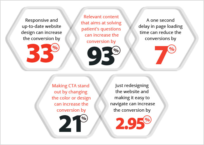
- A one-second delay in your website speed can cause a 7 percent reduction in conversions.
- A/B testing is the preferred method that can help you increase the number of conversions.
If you too are struggling and looking to improve your conversion rates, you must look beyond the traditional tips and suggestions for bottlenecks.

Here are seven key healthcare website design principles to help you achieve better conversion rates:
1. User-friendly, responsive website design: A user-friendly web design is easy for visitors to navigate. If your website is too difficult to follow, visitors will become frustrated and will be less likely to convert to patients. Your website should also include your practice’s phone number, email ID, address and location in the footer. Ensuring that vital information is clear and prominently displayed will result in a higher conversion rate. Also, visitors may be accessing your website on whatever device they are using.
According to SmartInsights, more than 80 percent of people use smartphones as their primary method for browsing the Internet. It is important to be mindful of this trend because 30 percent of mobile users are likely to abandon a website if it is not optimized for mobile browsing. By having a responsive website, you place your practice in the best position to connect with highly engaged potential patients.
If your website is not using a responsive, mobile-compatible design, then it is time to upgrade your website. Failing to do so will not only make you lose potential patients but will also cause a significant drop in search rank and organic traffic.
2. Make your unique value proposition (USP) clear: There are plenty of healthcare providers out there, so it may become difficult to differentiate yourself from the pack. While the unique aspects of your practice may be known to you, conveying a clear value proposition to your visitors is vital to your conversions. Your visitors should clearly see on your landing page why they should come to your practice and what unique services you offer. What are your main selling points? Do you claim to provide the best services using the most advanced equipment? Do you offer discounts? Your landing page or homepage should address the top questions that potential patients may have about your practice. You are likely to increase your chances of converting a visitor into the patient if you have a clear value proposition that encourages the visitor to take action.
3. Test your calls-to-actions (CTA) buttons: What is the purpose of each page on your website? After a visitor reads a page, what is the action that you hope they will take? Do you expect the visitor to make an appointment or contact you for more information? The easiest way to accomplish your goals is to add a call-to-action button at the end of each page that prompts visitors to take the desired action. The CTA buttons are an essential element for influencing your visitors and should be easily visible. Make sure strong calls-to-action buttons are present on all pages and stand out from the other information on the page. According to research, changing your CTA buttons from green to red can increase conversions by as much as 34 percent. Also, using encouraging language like “Click to see pricing plans” can help increase conversions by 252 percent. Placing the prominent CTAs, such as ‘Contact Us’ or ‘Request an Appointment’ inside a circle or button, can make them stand out from other elements on the page. Make it easy for the visitor to complete the action.
4. Test your headlines: The headline can make or break your patient conversion rates. The first thing a visitor reads on your website is your headline. The first impression is formed within the initial few seconds, and the headline plays a major role in shaping that opinion. It is important to know what resonates most with your visitors. While there is no magic wand to help you find the way, there are a few guidelines that you can follow.
If your headline is unclear or mysterious, you confuse your visitors into leaving. On the other hand, a well-written informational headline can encourage your visitors to take a closer look at your services.
Having a clear headline with a unique value proposition is critical. You can consider adding discounts or free services in your headline in order to attract more eyeballs. You will need to test a couple of ideas and see what works. Be creative with your headlines and inform the visitor of your USPs. The goal is to serve them useful information in a creative way that pushes them one step closer to converting.
5. Try to shorten and simplify contact forms: Limit the forms only to the necessary number of fields. How many times have you been willing to sign up for a service, continue and see more than 25 fields to fill in? Will you not just leave the site? Respecting visitors’ time is critical. If you have managed to encourage the visitor to sign up, it is important that you do not make him or her drop off because your form is too long.
If your aim is to convince a visitor to fill a form, make sure the form is small. Ask for the information that you really need. For instance, in an appointment request form, you should include fields for the patient’s name, email address, location and maybe the current illness.
Build short forms, and only ask for what you need. Try not to include optional fields such as username, birthdate, security questions and verification code. In fact, do not force your visitors to create an account, even if they are coming for the first time. You will end up interrupting their conversion process.
6. Use video content to engage visitors: Videos are far more engaging than static text content and can help you build an initial human connection with potential patients when they are seeking a new healthcare provider. According to a study, one out of every three healthcare customers is actively searching for healthcare videos online. Before uploading video content, think about the needs of your potential patients and what they are hoping to find when they visit your website. Most potential patients want to feel a connection with a practice they entrust themselves to and want to feel cared for in the process. Video content is a powerful way to convey that message and bring more patients through the door.
7. Offer live chat: Implementing a live chat feature is believed to increase signup form fills by almost 31 percent. Many websites use chat tools to generate leads and convert them to customers. A website visitor is more likely to turn into your patient if he interacts with a person, and this is what a chat box does. Visitors can directly click on the chat box and ask questions to the patient care representatives at the other end. With a chat box, you will also understand what your potential patients need or want from your medical practice, and this insight can help you enhance your services.
Your website is the online face of your medical practice. By stepping back, taking a consistent look and implementing these seven key tactics, you will be able to elevate your website from a mere online brochure to a lead-attracting and converting tool. The healthcare industry, as well as the preferences of patients, have changed drastically over the past few years. It is time for your website to do the same.
An excellent healthcare website design should strike a delicate balance between conversion goals and esthetics in order to sell your services. Your website should be striking enough to grab the attention of visitors, yet useful enough to convey the essence of your brand. An effective healthcare website will let the content stand out without the distraction of visual elements.
These healthcare website design tips will not only improve conversion rates, but will also help you attract more qualified traffic.
At Practice Builders, we have specialized in medical marketing and healthcare website design for over three decades. This singular focus gives us the expertise, data and the insight to build healthcare website designs that provide one of the best conversion rates in the industry. Contact us for a free consultation and quote.
