Is Your Medical Practice Website Delivering the Best User Experience?
Posted on
Are you noticing a drop in your website’s engagement levels? Is your website’s bounce rate giving you sleepless nights? Or are you looking for ways to attract potential patients to your medical practice website? If the answer to any of these questions is a Yes, then you need to pay attention to your website’s user experience. Merely providing product information and office contact details are no longer enough. Your website needs to act as a platform that is useful for your patients and helps convert their interest into appointments. Your website needs to delight and comfort visitors, and this is where your website’s user experience comes into the picture. Just by focusing on improving the way visitors interact with your website, you will be able to deliver a better user experience, increase traffic and grow your practice.
If visitors are not interacting with your website, it means your website is not adding any value, which dilutes the purpose of building a website. So when creating your website, make sure to keep your visitors’ needs and expectations in mind so you can increase engagement, boost the number of visits and improve the user experience.
When you are building a website for your medical practice, there is much more to it than just putting together product-related information. You also need to think about your target audience and design your website keeping the user experience in mind. Great user experiences are the backbone of any website.
The user experience determines whether you will see an increase in your lead generation, decrease in your bounce rate or an increase in your conversion rate. Medical practices are realizing that in order to stay competitive in this ever-evolving healthcare market, they will have to invest in improving their user experiences.
Naturally, marketers want their website to provide the best possible user experience so that maximum numbers of leads can be converted to regular customers. However, a website’s user experience is not confined to layout or the number of graphics used. Creating an encouraging user experience is an approach that covers all aspects of research, visual design and planning.

Why Is User Experience So Important?
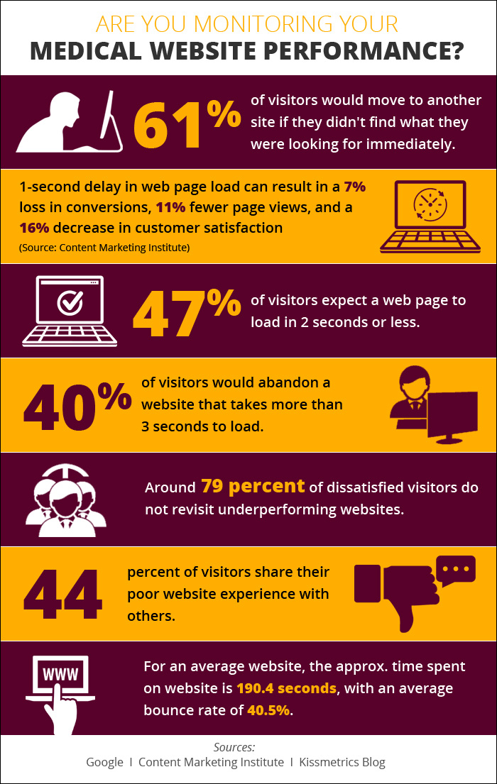
According to research by Content Marketing Institute, most website owners get just five seconds to engage a visitor before he or she leaves the website. Only five seconds! Before your industry-leading products or excellent content had a chance to get noticed by a website visitor, the game was over. A report by Google has revealed that almost 80 percent of visitors will move to another website if they fail to find what they were searching for.
Search engines consider user experience when returning organic results. Users’ attention span is decreasing considerably with the move toward smartphones, and the digital healthcare market is more competitive than ever. Optimizing the usability of your website can have a significant impact on decreasing your bounce rate and improving the user experience.
By designing a website that is focused on user experience, you can create a space that is easy for visitors to understand and navigate. This approach can set your website apart from competitors who are not as concerned about user experience, thus increasing your website traffic and conversion rate.
Here are some key stats on the importance of user experience in web design:
- More than 65 percent of visitors prefer a website that is optimized for user experience over a plain website.
- Incorporating a more appropriate color combination can improve your bottom line.
- Nearly 48 percent of visitors would feel frustrated when websites are poorly optimized for mobile devices.
- 94 percent of visitors form the first impression about a website based on its design and overall esthetics.
For beginners, here are some of the key essentials for user experience:

- A web page that is quick to load;
- Simple navigation;
- Well-written and well-presented content;
- A visually appealing web page layout.
Tips on Delivering the Best User Experience
In order to deliver a good user experience, you will need to consider the primary reasons why visitors will be flocking to your website, the way they may use your website and the different functions they are likely to perform on your website.
Delivering an intuitive and engaging user experience requires many steps. Here are seven tips to help you deliver an amazing user experience to your website visitors.

1. Improve Page Load Time
Page loading time is a critical part of any website’s user experience. Web designers tend to compromise on page load time to accommodate esthetic designs and new functionalities or to add more content to web pages. According to a study, nearly 40 percent of visitors will leave your website if your web page takes more than three seconds to load. Slow page load is a disrupting experience for your website visitor and it can be a reason for a high exit rate. According to research, a two-second delay in page load time can result in exit rates of up to 87 percent.

2. Design for Your Target Audience
Almost two decades ago when online interactions were still in their infancy, website visitors were willing to spend all of their time learning the tips and tricks to complete activities on websites. If visitors were confused, it was assumed they just were not tech-savvy on how to navigate the Internet. But today, users are not as willing to learn how to navigate through your website. These days, users become frustrated when they feel a website is confusing or substandard. While it is exciting to design your website to suit your preferences and tastes, that will not help your website visitors navigate your website. Think about what your target audience wants to do and help them complete those tasks easily and intuitively. Improving user experience on your website starts by understanding what your target audience wants and what is preventing leads from converting to customers. The most important insights on how to design an easy interface should come from your target audience.
3. Simplify Navigation
The hallmark of a great website is simple and easy-to-use navigation. Your website visitors’ primary goal on your website is to find information. Simple navigation means your visitors can focus on the content and find the desired information faster. Whether they are searching for your contact details or information on treatments, they want to find it fast. It is important to streamline the information and remove the clutter. Clean and simple navigation will help your visitors find the information they need quickly. In order to give your users a smooth navigation experience, try to use common layouts and avoid creating dead-end web pages. Make sure all your pages have internal links so your website is watertight.
4. Include Effective Calls to Action (CTAs)

Having relevant CTAs on your website will help grab the attention of your visitors and improve user interaction while achieving business goals. If you want your website visitors to take instant action and to convert, using strong CTAs help you achieve that. Your CTA must be included on every page of your website. This will help improve the conversion rate and add to the unique user experience. Remember to place your CTA above the fold so that your visitors can easily view the button and respond to it in case they want to. Making your CTAs easily accessible is an effective way to increase your conversion rates.
5. Create Engaging Content
One of the primary purposes of your website is to deliver great content to your target audience. However, website designers often make the mistake of treating content as secondary to design. If you are serious about giving your visitors a great experience, then both design and content must be seamlessly integrated. In addition, every piece of content must have a purpose for your website visitor. It is important to prioritize the information your visitors will expect from your website and display it accordingly. It is not just about the information; it is also about the way you present it. If you are looking for ways to interact with your visitors and acquire new patients, then start with your content.
6. Optimize for Mobile
Smartphones are driving a significant amount of traffic to websites, and this makes it essential for your website to be mobile-friendly. In order to serve the browsing needs of mobile users, responsive web design is an easy way for website owners to ensure better user interface. Users expect information to be readily available on whatever device they decide to use. It is important that your website be mobile-friendly and easy-to-navigate regardless of the screen type through which it is being accessed. Responsive web design will allow you to cater to your visitors’ mobile web experience. The user experience on mobile devices may even be more important than the desktop experience.
7. Maintain Consistency
Consistency in website design means making everything match. Make sure heading size, fonts, colors, button styles, spacing and design elements are coordinated to make your web design coherent between pages. In order to provide your visitor with an amazing user experience, it is important to create a consistent website. Drastic design changes can make your visitor feel lost and confused. Inconsistencies in design and layout will lower the quality of the services you are offering through your website. Consistency in the website design will add to the user experience. On the other hand, if the website is clunky and does not provide the information and experience that users expect, then they may not come back to it again.
Conclusion
Your website is the backbone of your medical practice’s online presence. Clean and simple web design will always outperform a messy page. Truly fantastic user experience changes subtly over time and becomes better each time you turn it – faster, more intuitive and more relevant.
When creating your website, it is important to design it in a way that fits the uniqueness of your medical practice. Just because something has worked well for another practice does not mean a feature or functionality will also benefit you. With a little bit of research and creativity, you will be able to design a website that attracts patients and improves your conversion rate.

 Why Good communication Matters in Healthcare
 De-Escalation Tips for Handling Aggressive Patient..
 Reaching The Right Audience Through Target Marketi..