How Website Design and Patient Experience Impact Your Profitability
Posted on
First impressions matter, both for face-to-face and online patient experiences. Therefore, you need to understand the importance of user experience in web design and build your healthcare website to be esthetically pleasing so that it makes a positive impact from the get-go. Failure to do so will result in the loss of patients before they even start browsing your service pages. However, if you do not have an intuitive, easy-to-use layout, you will quickly lose your existing patients as well.
In an increasingly competitive healthcare marketplace, excellent patient experience is imperative to staying ahead of the competition. This blog will cover several areas in user interface design where small improvements can lead to big wins for your medical practice.
Performance
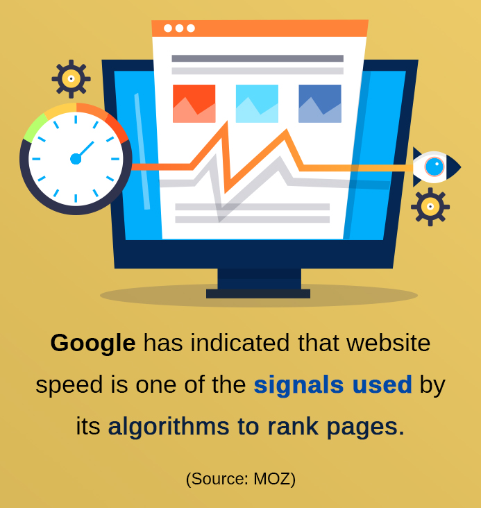
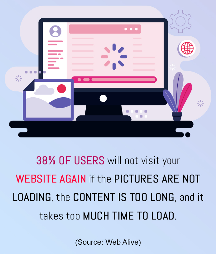
Patients tend to be impatient, and if your website does not load quickly enough, chances are high that visitors will navigate elsewhere before they even see your services. This is why it is essential to optimize performance so that the website loads quickly. If this does not happen, nothing else you do will matter because you will not have the patient’s attention.

Presentation and Design
Your prospects start forming their opinions of your medical practice based on its website from the moment they see it. And it takes just a few seconds for their eyes to land on features that will influence their opinion of your services. When asked for website-related feedback, most people commented about the website design for healthcare practice: busy layouts, lack of navigation aids, hard-to-read text and so on.
Patients indicated that they rejected and distrusted a healthcare website with complicated design. If there is something that stands out negatively, there is a high chance of them navigating to another website rather than exploring deeper. Luckily, an excellent website design for healthcare practice need not be complicated. Simplicity, consistency and a well-defined hierarchy are significant factors in whether a patient responds positively or not to a website.
Intuitive Navigation
Patients want to be able to navigate your website effortlessly and find what they need quickly. Whether they do so using menus or through a search option, your website should instantly present the patient with what they want to see.
Give your patients lots of options for finding what they want.
Furthermore, your patients probably have a goal in mind when they land on your website. Be sure to consider the whole patient experience and guide the patient through the action they want to complete. For instance, if you’re a dermatologist, make it easy for the patient to find products that treat acne by creating a separate page. The patient shouldn’t have to search for acne-treating products in the vast ocean of your products and services. Your patients shouldn’t struggle to find a link to their reports or appointment schedule or to provide billing information because these placements were not very well thought through.

Additionally, the whole appointment scheduling process likely consists of a lot of steps. If the patient has issues completing any of them, he or she will probably drop the idea of visiting your practice. This is one area where API monitoring will help you identify and resolve issues quickly before they impact your website visitors. With timely access to the necessary information, your patients will see fewer problems when they visit your healthcare website.
When done well, your navigation can encourage visitors to take the next step. It should guide them through the steps they need to schedule an appointment or download an eBook without hiccupping or generating errors. There are several steps required to complete an action, so don’t force the visitor to go to the next level. If you do, the visitor might abandon your website.
Quality Visual Aids and Informative Descriptions
One of the reasons people prefer calling in and booking appointments is to talk to your staff and feel their professionalism and responsiveness. With online appointment booking, patients don’t have these options, so you need to compensate for this lack of sensory experience with well-designed pages and quality visual aids.
A majority of website visitors will quit your website due to insufficient information. This is because they will want to know what they’re getting, and if they are left to make guesses about your services and prices, they won’t choose you. They will choose your competitors. You do not have to write long pieces of content describing your functions; you should aim for clarity and brevity.
Videos give your patients information photos don’t.
You probably know that lots of high-quality graphics are a great thing to have on your service pages, but if you can include videos, that will be even better. Not only do videos provide service information over and above that provided by images, but they also encourage your website visitors to stay on your pages longer. The average visitor spends only six seconds on a page, so any encouragement you can offer to the visitor to stay longer increases the likelihood that they will convert.
Visual aids are essential, but be sure they do not slow down your website. Images and videos are often large files, and you might have many of these files on your website. Be sure to optimize both file types so that your pages load faster. With images, please choose the correct format and compress them correctly. With videos, consider hosting them elsewhere and embedding a video player onto your healthcare website. Your website visitors will still have to wait for the video to load, but your web server will not need to handle it. Regardless, you should optimize your video content as well to ensure they are not dragging down your website page load speeds.

Takeaways
The healthcare marketplace is increasing, and profit margins get slimmer and slimmer. As such, you must build an online presence that resonates positively with your patients since patient satisfaction with your website directly leads to increased conversion rates. To do this, you must prioritize these four areas, since improvements to any of these areas will lead to big wins for your medical practice:
- Website performance
- Website design
- Patient navigation
- Quality descriptions and visual aids
Did you notice that website performance is the first area we mentioned? Your website must be as fast as possible. Without quick page loads, other strategies will matter little. For additional information on how Practice Builders can help you get your healthcare website in tip-top shape and keep it there, contact us, the experts, today!

 Reaching The Right Audience Through Target Marketi..
 Key Elements Affecting Your Website’s Performanc..
 Proactive vs. Reactive Healthcare: Deep Guide