10 Principles of Good Website Design for Healthcare Practices
Posted on
A website can’t succeed by excelling just in content or design. It also needs to have an appealing layout that feeds into its user experience and functionality and complements your content.
Your website also needs to communicate with your target audience what you specialize in, why you do it, and who will benefit from your services. It is so easy to be caught up with how awesome you are as a healthcare provider that you forget to make sure you are addressing core concerns your target audience considers first and foremost.
So, how can you improve medical website design?
Here are ten principles of high-converting medical websites to help you ensure your site not only offers the content-rich element your visitors are seeking but also drives conversions.
1. Have a Plan for Healthcare Website Design
Do not just start website design for your healthcare practice. To ensure that your healthcare website is effectively meeting your visitors’ needs, you need to map out your patients’ journey from the first time they visit your site to the moment they become a patient.
What pages are your visitors going to view? What content will they read? What offers are they likely to convert to? Understanding all these aspects will help you design a site that nurtures leads through the sales funnel.
You want to healthcare website design for the next step, not the final step. It is all about answering the right questions in the correct order.

2. Remove Detracting Elements
Some aspects of your healthcare website are going to detract from the value and message you intend to convey. Complicated graphics, thick walls of content, and poor image quality are some of the many detractors.

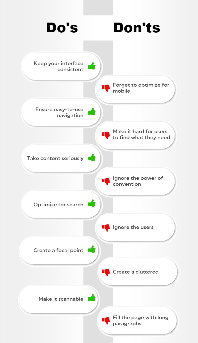
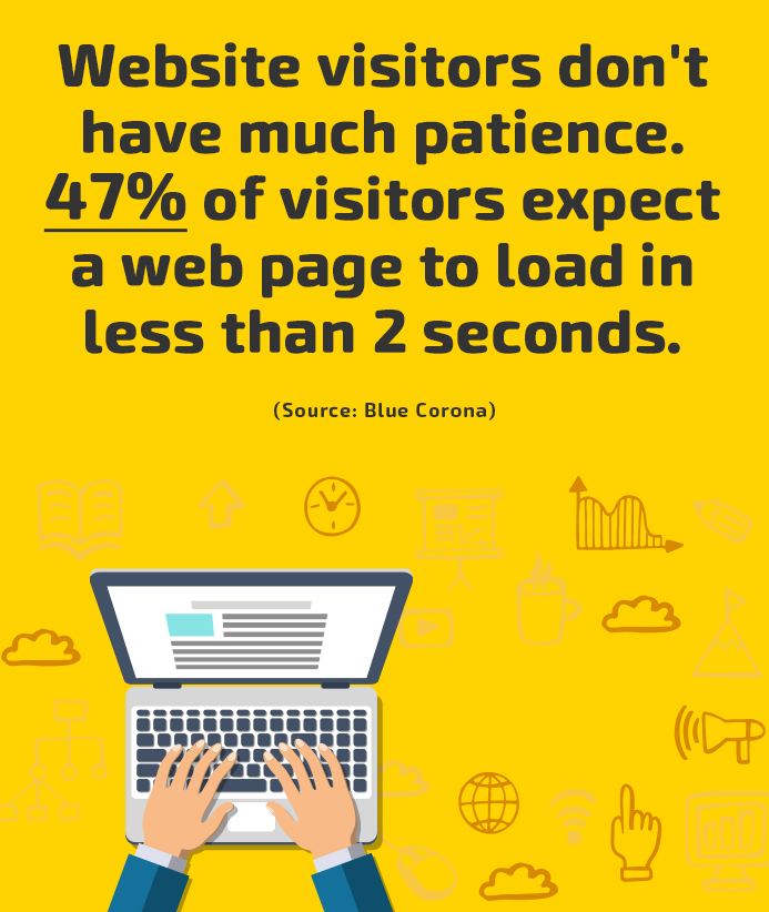
With a target audience that has an attention span of only a few seconds, you need to create a first impression that gets the key points across quickly. This should be done with short and relevant doses of content and graphics that are sectioned off by clear headers.
And yes, jargon or ambiguous terminology will only muddy your content and confuse visitors.
3. Include Social Media Follow Buttons
Creating great content only goes so far if you are not allowing your visitors to share what you have.
If your website lacks social share buttons, you could be missing out on a lot of social media traffic that could be generated from people already reading your blog on different platforms.
Social sharing buttons are the buttons that are placed around the bottom or top of websites and blogs. They contain icons of different social media platforms and allow you or readers to share the page on various social media platforms.
4. Place Strong Calls-to-Actions (CTA)
Once your visitors land on your website, do they know the next step? Will they know what pages to view, or what actions? No – unless you provide them with some direction.
CTAs are one of the many elements that help visitors take the next step. Don’t fall into the trap of spamming your website with the most bottom-of-the-funnel (BOFU) CTA, without even nurturing your visitors with other CTAs that are on top or in the middle of the sales funnel.

To recognize whether or not you are making this mistake, start reading through your website pages. Do you find most pages with only one CTA for a trial or an appointment? If yes, it’s time to update.
5. Use Relevant Images
Not every graphic is going to fit with the type of message you are conveying to your target audience.
Just because a stock website has the relevant image you are looking for does not mean it looks real and will evoke trust in your brand. Ideally, you should use photos that portray images of real people who work at your practice.
If real pictures are not an option, you can use different techniques to pick out the right type of stock photo that brings realism to your healthcare brand.
6. Focus on Navigation
When designing your healthcare website, pay special attention to navigation. Navigation is the map that displays the core pages visitors can look at.
There is hardly anything worse than a website with confusing navigation. When improving your site’s navigation, make sure your visitors can quickly find what they want.


Some characteristics of a lean navigation bar include navigation hierarchy, streamlined content and mobile-friendly design, so the user experience doesn’t drastically change on a smartphone or other mobile devices.
If visitors cannot find what they are looking for, they will have no reason to stay on your website. Instead, they will bounce and land on your competitor’s site that might offer a better user experience.
7. Include White Space
White space is the area around elements on a web page that are empty and lack content or graphics.
White space also called “negative space” is an important design element that helps you break up the web page and increases readability.
Although white space may seem redundant, it’s responsible for content prioritization and improved readability. It also plays an integral role in positioning different design elements.
If your web pages lack white space, review the pages and strip graphics and content that are not absolutely necessary to achieve your goals. After that, make sure content is grouped so that visitors can distinguish where they are headed.
8. Optimize for Mobile Devices
If someone accesses your website on a mobile device, how will things look? Will the visitor need to continually zoom in and out to browse your website or scroll through your home page? If yes, then your website lags on mobile optimization and needs to be updated.
It’s a necessity to make your website mobile-friendly and responsive to fit the needs and wants of your target audience.

9. Invest in Search Engine Optimization (SEO)
If you’re going to develop a robust online presence, then you need to create a website that will be found.
This starts with an SEO strategy that takes into consideration the keywords your target audience will search for. This strategy should include creating content that is relevant to your visitors’ needs. Blogs, videos, and e-books are some of the many examples of SEO-optimized content.
Make sure you do not become sidetracked by the endless possibilities you could rank for. Identify the exact keywords that your target audience is searching for so you are only attracting qualified leads, not uninterested visitors who would never convert.
10. Identify and Fix 404 Errors
Depending on the size of your healthcare website design or how long it has been around, you may have a few pages or links that are not working.
Take the time to evaluate whether your website has broken pages or links. You may be surprised to find high-performing landing pages that are unpublished or pages that are incorrectly linked.
Fix all 404 errors and broken links, as they hamper user experience and increase bounce rates.

Conclusion
Is your website missing some or all of these design principles?
Now is the time to take action! After all, ineffective website design could be causing you to lose valuable patients!
Wondering what a good medical website design looks like? Contact Practice Builders, and we’ll help you update your website!

 Reaching The Right Audience Through Target Marketi..
 Key Elements Affecting Your Website’s Performanc..
 Proactive vs. Reactive Healthcare: Deep Guide